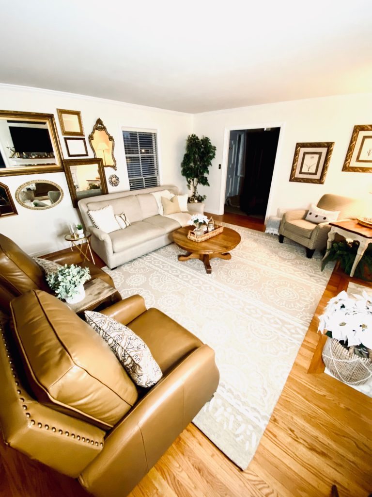
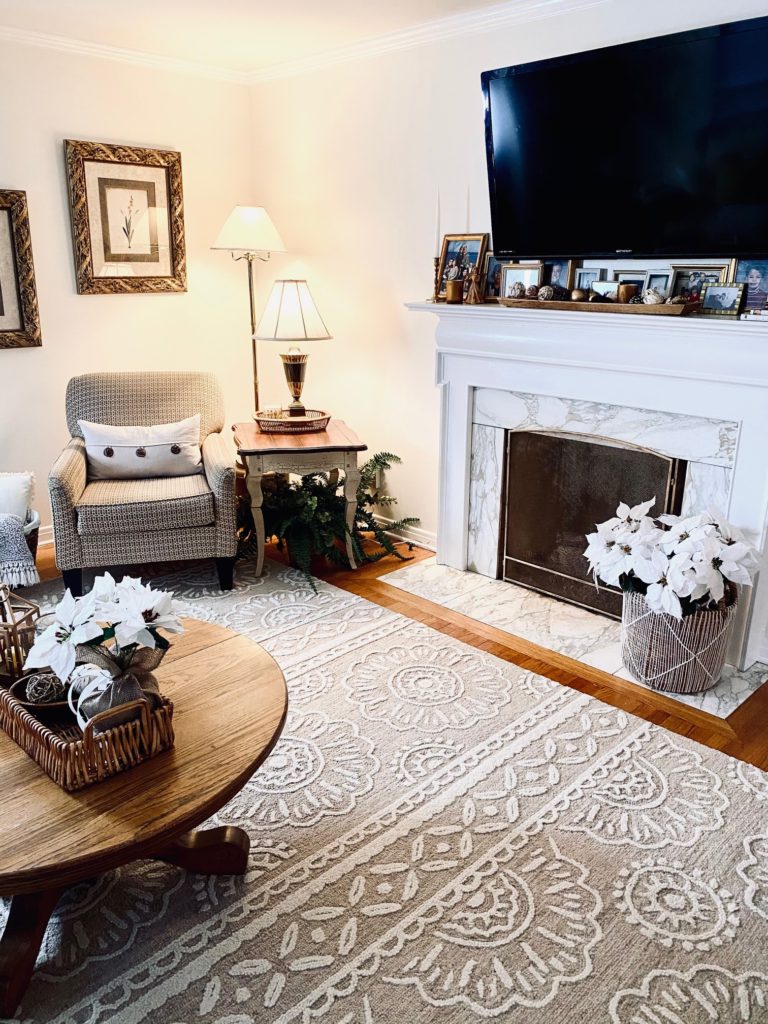
I do not consider room refresh, updates and makeovers work. I find it therapeutic, relaxing and rewarding to renovate a space and give it a fresh look. That is why my home is in constant flux of me rearranging, changing and updating. I move from room to room and always find a new project to undertake. Recently, I’ve been helping friends and family with room updates (the pictures used in this post are from my latest room makeover at my brother and sister in laws home. All the details on the complete room refresh HERE). Between my own home as well as the homes of others, I’ve seen a lot of what works and what doesn’t when updating a room. There are some common mistakes I see over and over. Here are 5 design mistakes to avoid when updating a room.
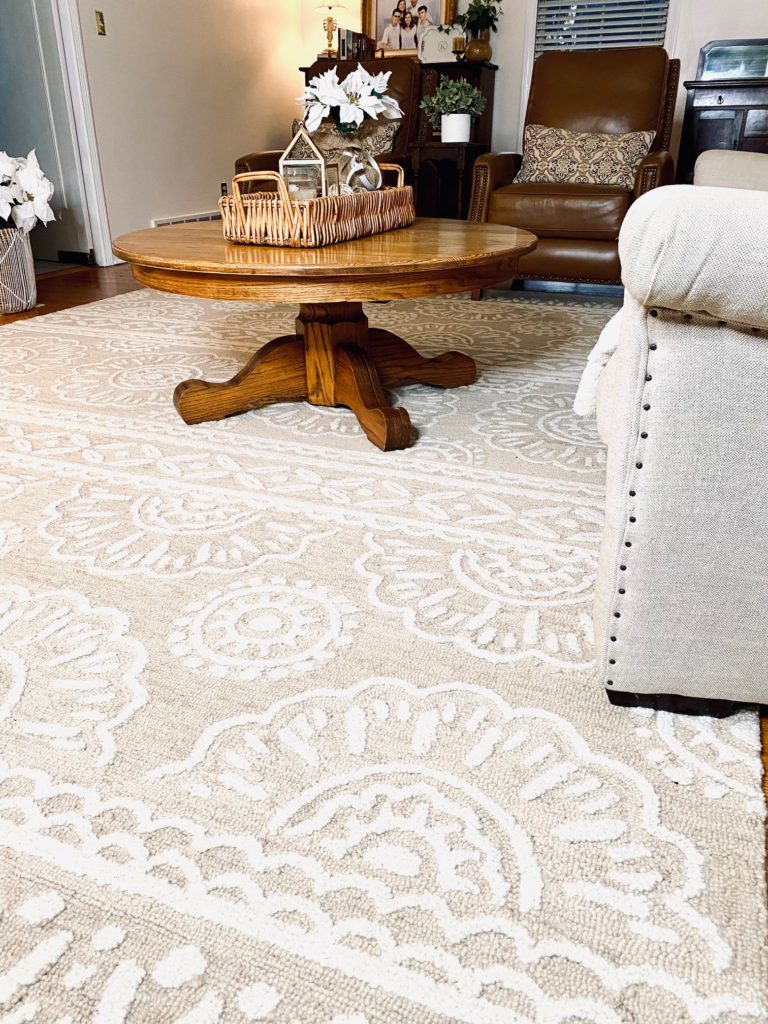
Choosing too small a rug
A rug should minimally be big enough to anchor the front legs of your large furniture on. Ideally, a rug is large enough that all four legs would be on it.
Artwork too small or too high
Don’t have a floater! A piece of artwork, frame or picture that is too small for the space or hung too high so it appears to be floating in space! Wall art should span 2/3 the length of a sofa. If you are unable to find a piece that large then find something as big as possible and add smaller pieces around it for a gallery effect. Also, don’t hang artwork too high. Many times artwork looks best not hung. Instead try resting it on a ledge, mantle or dresser
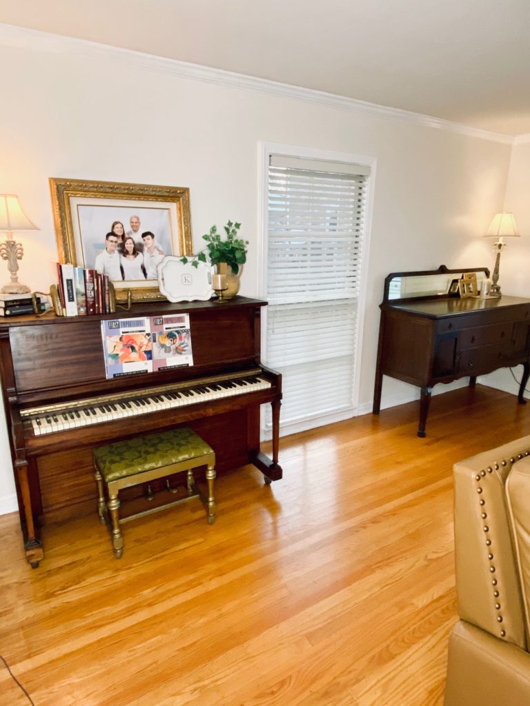
Not enough or bad lighting
If a room lacks natural light then bring in ambient light with floor and table lamps. Don’t be afraid to layer lamps just like you layer decor.
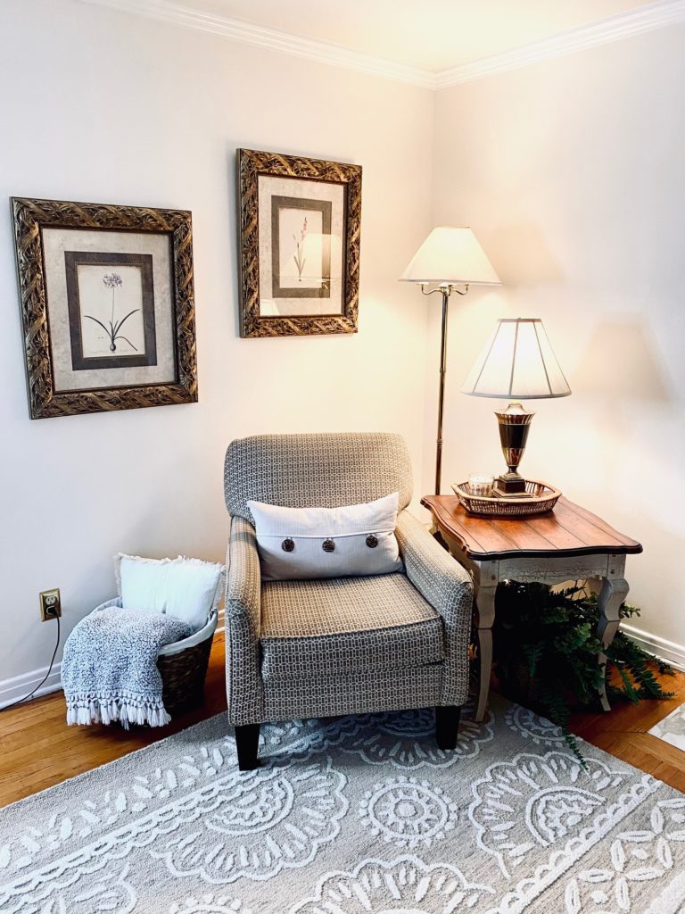
Don't sacrifice comfort for style
Don’t let your space become unused and bleak because it’s not comfortable! To warm up a space scatter cozy throw blankets and plush pillows to make it more inviting!
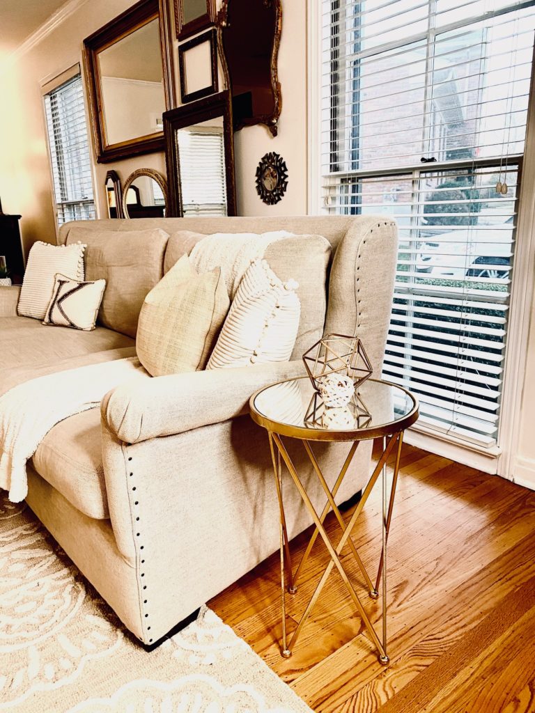
Not enough table surface
The rule is to be able to reach a surface from wherever you sit in a room. One side table is not enough. A well designed room has ample table space for drinks, books, candles and decor.
